RCM Dashboards
Keep a pulse on your collection rates, denial reasons, and cashflow with powerful visualizations that turn your data into meaningful insights.
Chart Tips
- When looking at data month over month, consider using a view filtered to data from the last 6 months, to prevent over-crowding the graph. When looking a data quarter over quarter, switch to a view with a wider filter (last three years) or no filter.
- You can refresh, jump to the underlying data, or expand the chart to full screen from any chart. Click on any segment of the chart to drill down.

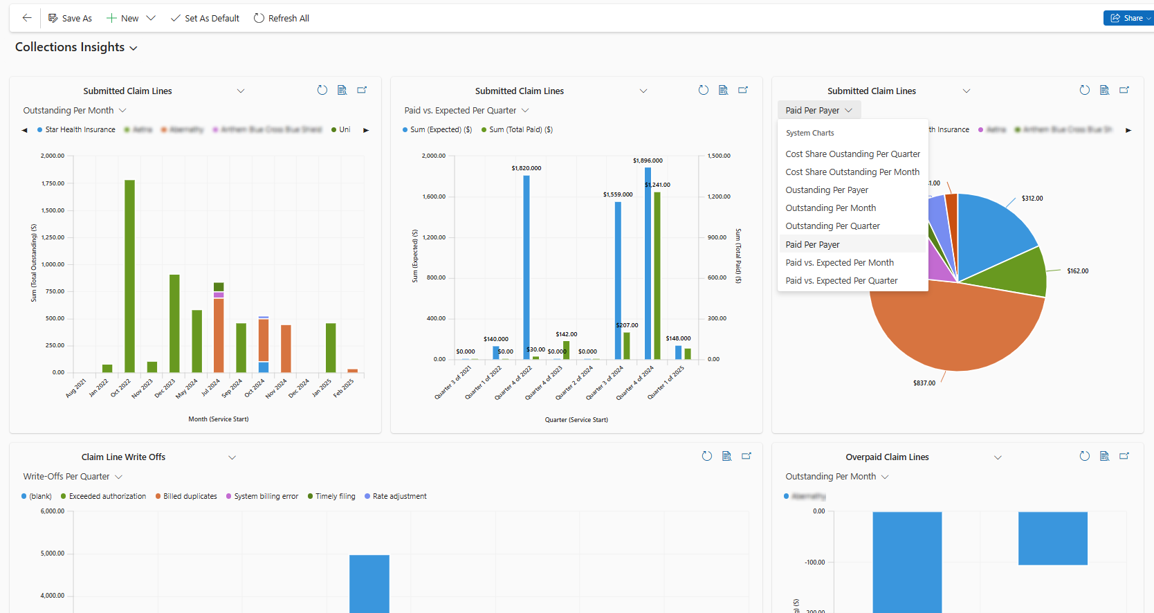
Collections Insights

- Outstanding Per Month- How much is outstanding from each payer for each month of services?
- You can expect to see an upward trend on this graph, with the outstanding amounts from more recent months highest (since the claims were only recently submitted and not paid yet), and outstanding amounts from past months low or zero.
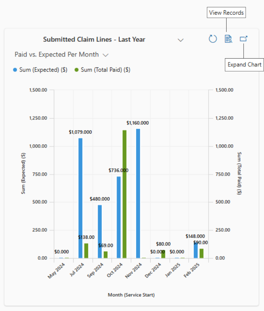
- Paid vs. Expected Per Month- How much was expected and how much was paid for each month of services?
- With side-by-side bars for paid and expected, it's easy to visualize which months of services were fully paid and which have outstanding balances. You'll also notice an increase of the expected amount over time as your organization grows.
- Outstanding/Paid Per Payer- What's my payer mix? Which payers do I receive the most from? Which payers are accountable for my A/R?
- Cost Share Outstanding Per Month- How much is outstanding from cost share sources (patient pay, secondary coverage, etc.) for each month of services?
- This reflects cost share outstanding per claim rather than the payer outstanding per claim.
- Write-Offs Per Month- How much was written off each month, for which reasons?
- Overpaid Claim Lines- Showing the outstanding amount per month against a view of claim lines that were overpaid will show you how much was overpaid each month.
- The overpayments will show as negative amounts on this chart.
note
Claim line views on the Collection Insights dashboards are configured against Submitted Submission claim lines. The Month/Quarter is based on the date of service on the claim.
Denial Insights

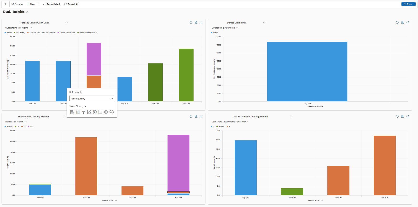
- Partially Denied Claim Lines received remits but were not fully paid yet. Paired with the Outstanding Per Month chart, you can easily understand how much is outstanding on your partially paid claim lines from each month.
- You can expect this to look like a bell curve, with earliest months eventually reaching fully paid, and latest months not receiving remits yet.
- Denied Claim Lines received remits, but were not paid at all yet. Paired with the Outstanding Per Month chart, you can easily understand how much is oustanding on claim lines that were fully denied.
- Denial Remit Line Adjustments are the actual adjustments for each remit line, and reflect the amount adjusted and adjustment reason. CO (Contractual Obligation) and cost share adjustments are filtered out of this view to help you focus on denials. On the Denials Per Month chart, you can see how much was denied for each month's services, and for which reasons, so your organization can aim to decrease your denial rate.
- Cost Share Adjustments are adjustments for cost share reasons, so you can see how much was denied as a cost share responsibility, and how cost share impacts your organization at large.